The following steps explain how to configure and use the Palette Picker from the creating of the data type to using it in the views.
We assume the package has been installed already. Otherwise, please refer to the Resources section.
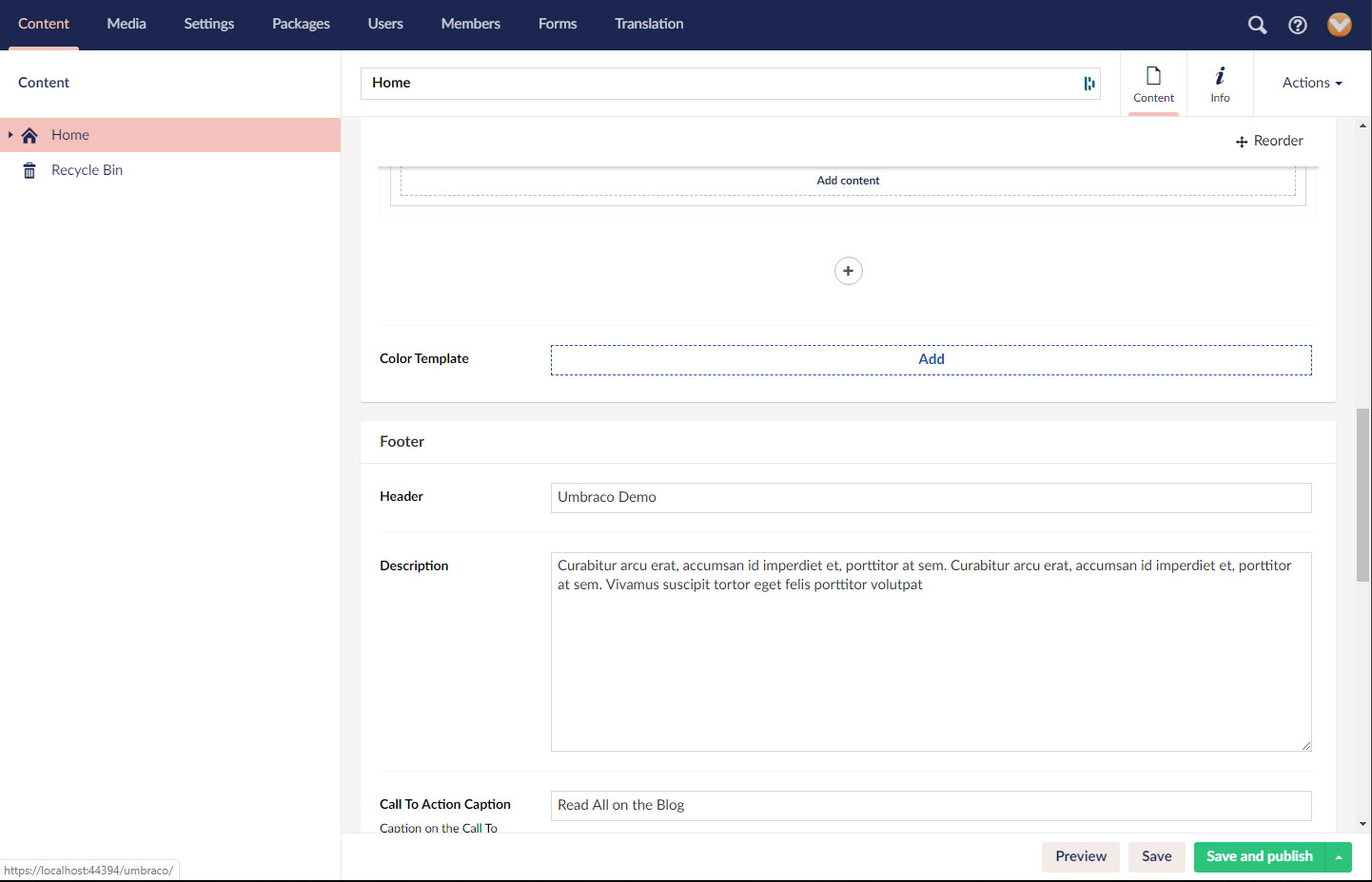
Configure data types
To create the data type we do as for any other data type that we want to create in the Umbraco backoffice. In Umbraco V8, we find our collection of data types in the Settings section, while in previous versions we can find it in the Developer section. In any case, the process is the same and we can create a new one by clicking on the three dots next to the “Data Types” title on the left hand side tree.
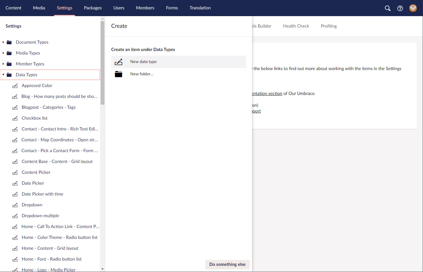
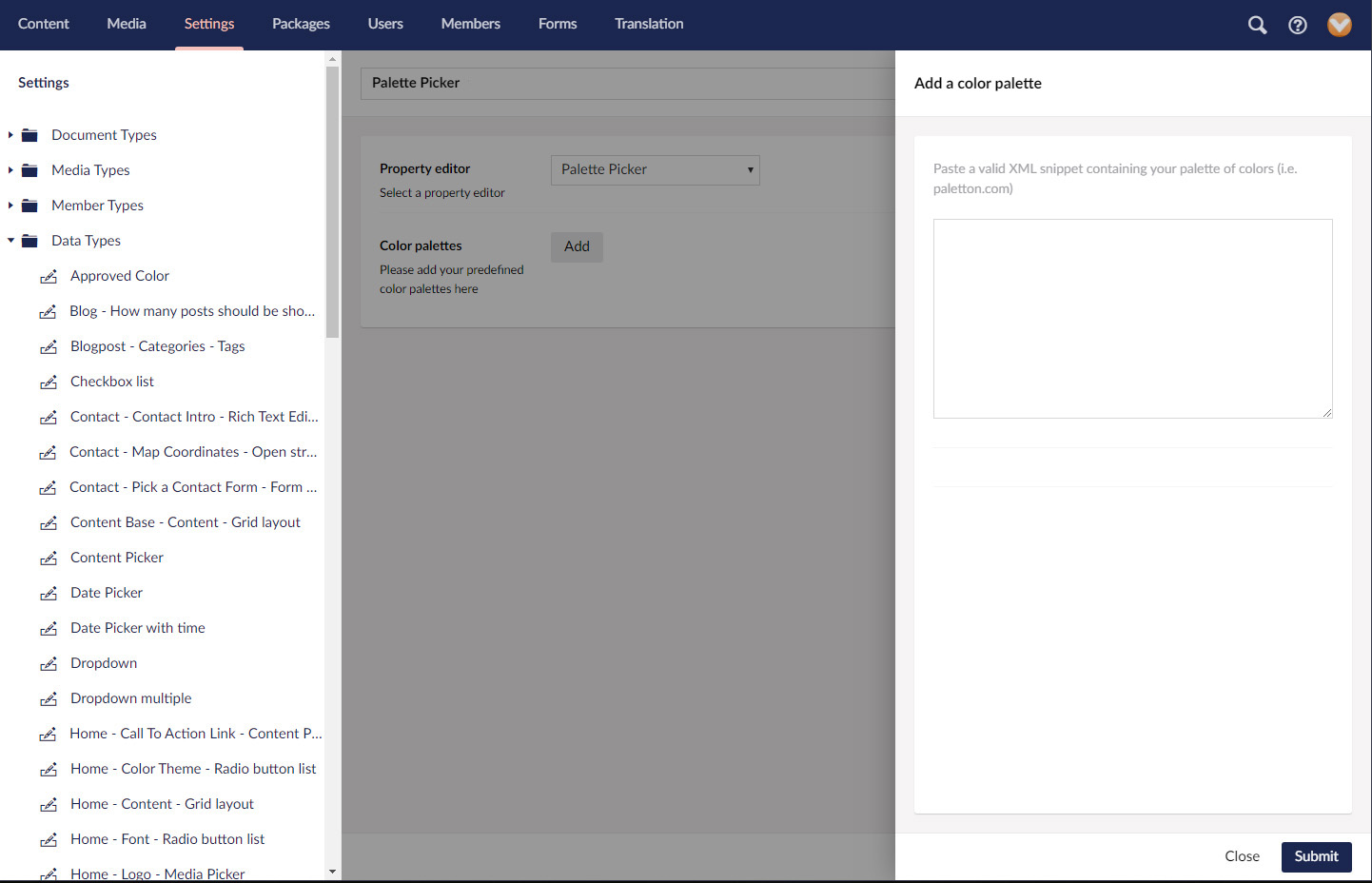
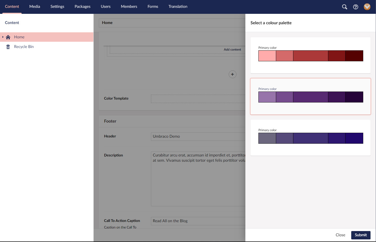
From the property editor dropdown, we need to select “Palette Picker”. Once selected, we can see a new configuration property underneath for “Colour palettes”. Here we will configure the colour templates that will be available to use on our document types. We can add new ones by clicking on the “Add” button. We will be prompted then by a side panel to paste a valid XML snippet to define a new palette of colours.
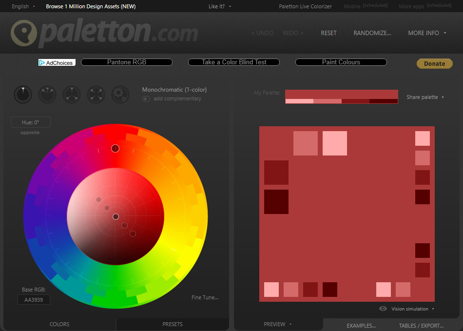
Palette picker is based on Paletton.com. We can get our colour palette from there. The paletton interface is very intuitive. We can have a play with it until we find the right colours. Generally, it will let us choose up to 4 different colours, each one configuring a colour set. Each colour set will then split into 5 different shades, making our full palette. Once happy, if we click on “Tables/Export” on the bottom right corner, and then click on “as XML”, it will generate the XML snippet with all selected colours. Palette picker will accept any colour configuration with sets of primary, secondary and complement colours. But the current version will only accept snippets in XML format. Future versions of this package might accept other formats. We can use a snippet from any other source as long as it is in XML format.
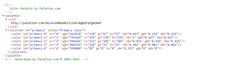
We then copy the snippet into the textbox. If it is well formatted, we will see the template preview below it, otherwise it means the snippet is not well formatted or contains errors.
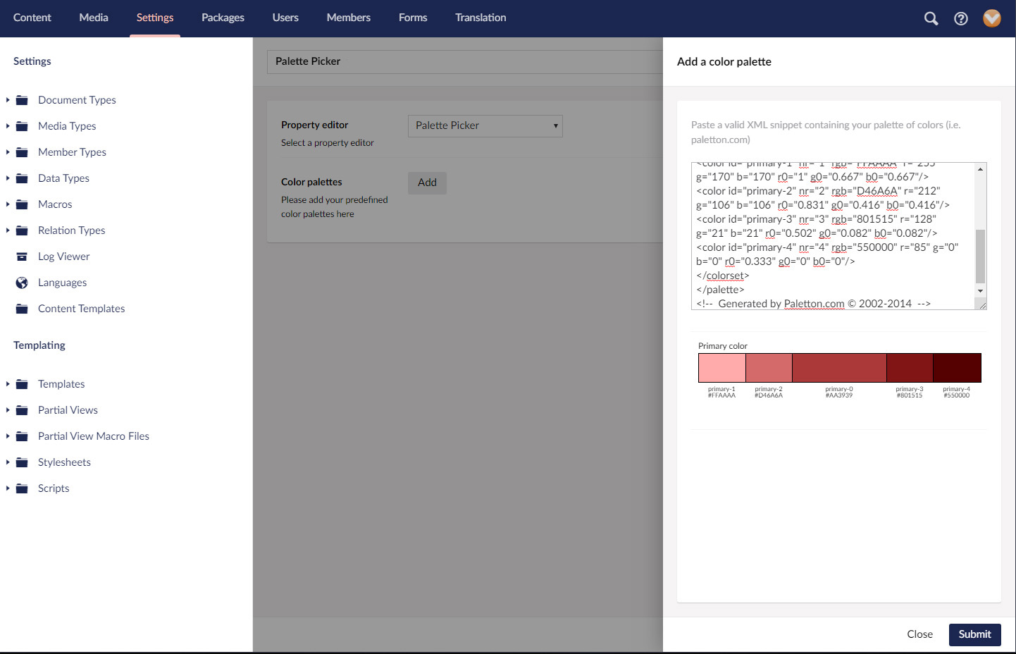
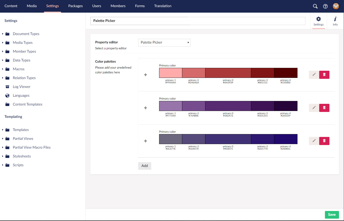
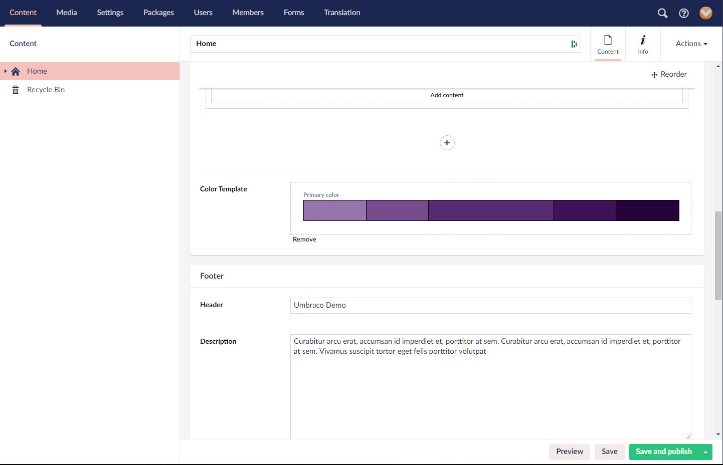
We can add as many templates as we like, which are visible in the data type configuration.
Finally, we give a name to our newly created data type and save it.
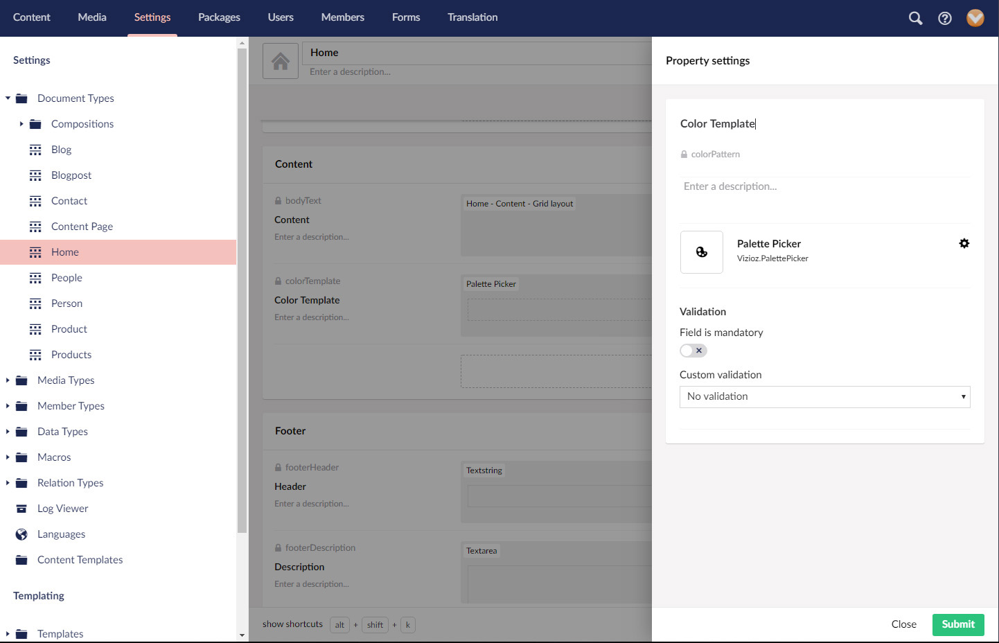
For editors to be able to use the Palette Picker in the content nodes, we will have to add it previously as a property in our document types.
Editors
Editors can very easily change the value of the Palette Picker value in content nodes. The property is displayed in a similar way to a content picker. Editors can add a single colour template or remove it.
Add to view
This is the part that involves a bit of code.
The first thing to do is to import the colour template styles into our view. We use the Palette Picker extension methods to do this. Don’t forget to include the @using statement. Depending on whether we are using Models Builder or not, we can use the following methods:
// With models builder
@using Vizioz.PalettePicker

@Html.Raw(Model.PalettePickerProperty.GetCssStyles())
// Without models builder
@using Vizioz.PalettePicker

@Html.Raw(Model.GetCssStyles("palettePickerPropertyAlias"))
This will render an internal CSS stylesheet with a series of rules from to the colours contained in the Palette Picker value. These rules will have class selectors containing properties for color, background-color and bordercolor, for every colour defined in the Palette Picker value, as in the example below.
<style type="text/css">
  .primary-0{
    color:#582A72 !important;
  }
  .bg-primary-0{
    background-color:#582A72 !important;
  }
  .border-primary-0{
    border-color:#582A72 !important;
  }
  .primary-1{
    color:#9775AA !important;
  }
  .bg-primary-1{
    background-color:#9775AA !important;
  }
  .border-primary-1{
    border-color:#9775AA !important;
  }
  .primary-2{
    color:#764B8E !important;
  }
  .bg-primary-2{
    background-color:#764B8E !important;
  }
  .border-primary-2{
    border-color:#764B8E !important;
  }
  .primary-3{
    color:#3D1255 !important;
  }
  .bg-primary-3{
    background-color:#3D1255 !important;
  }
  .border-primary-3{
    border-color:#3D1255 !important;
  }
  .primary-4{
    color:#260339 !important;
  }
  .bg-primary-4{
    background-color:#260339 !important;
  }
  .border-primary-4{
    border-color:#260339 !important;
  }
</style>
For secondary and complementary colours, the rules will have similar class selectors, for instance, bg-secondary-1-1, bg-complement-1. For full reference, please go to CSS rules.
Besides class selector, we can generate selectors for pseudo classes and pseudo elements. For full specification, please go to the API section.
We now can apply the necessary classes to our HTML elements. For instance:
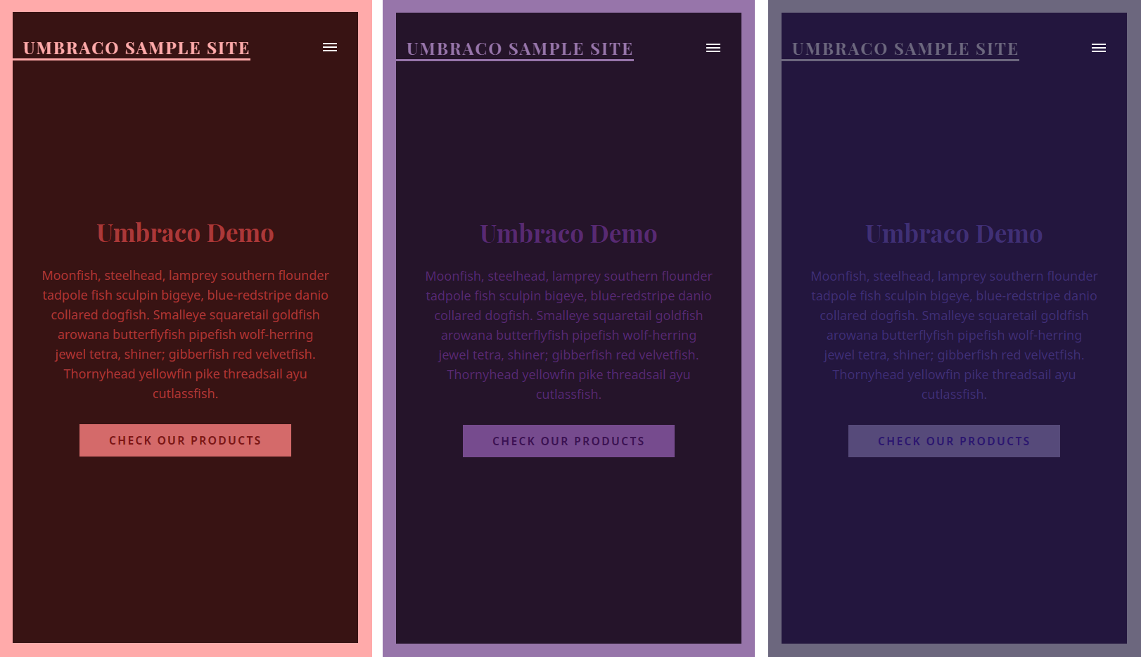
<div class="primary-0 bg-primary-1 border-primary-4">I love Palette Picker</div>
Will result in something similar to:

By changing the value of the Palette Picker property in the content nodes, the colours displayed in the view will change accordingly.